
Lab 7
Data classifications and mapping

For your lab log, list specific guidelines from Making Maps for each of the map types (see below), list your design choice, and why you made it. Obviously, make the changes in your ArcGIS Pro project.
a Choropleth (graduated color) map
data classification choices: Making Maps, pp. 173-181
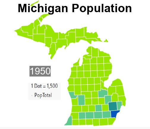
I have a 6 class are map for my counties, if you were to include the class of no data It would be 7 class. I also changed the colors to be more eye catching. My quantitative scheme was also changed through my dot density map as I changed the point data to represent 1 dot = 1500 from 1 dot = 20,000 making the data more extreme. The equal interval scheme is unchanged.
symbolization choices: Making Maps, pp. 220-221)
For my Choropleth map I changed the color scheme, with value legend and boundaries.
a graduated symbol map
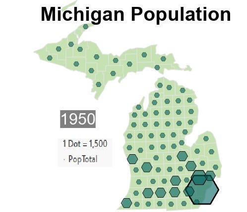
data classification choices: Making Maps, pp. 173-181
For this I changed the symbols and their color based on population monochromatic through their value
symbolization choices: Making Maps, pp. 220-223
I used a classified legend with shapes.
a dot density map

don’t have to classify data
symbolization choices: Making Maps, pp. 226-227
I lowered the population per dot from 1 = 20,000 to 1 = 1500. The size was changed as well so that this change wouldn’t be overwhelming and become a big blur.


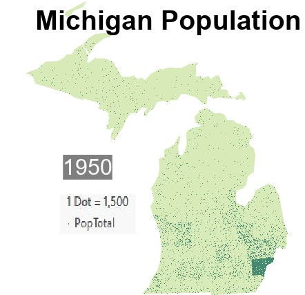
post the three maps here so i can take a look before we animate them.